Table of Contents
The Financial Close Visibility Gap
The month-end or quarter-end financial close is often described as a sprint (a high-pressure period demanding accuracy and speed. Yet, many finance teams navigate this critical process with limited real-time visibility. Relying on static checklists, endless status update emails, and disparate reports often obscures bottlenecks and delays progress until it’s too late. My research indicates that teams lacking centralized, real-time close visibility often spend valuable hours simply tracking progress instead of actively resolving issues.
An effective financial close dashboard transforms this reactive scramble into a proactive, controlled process. It serves as a central command center, offering an at-a-glance overview of the entire close lifecycle. What should such a dashboard encompass from an analytical perspective?
Key Components of a Close Dashboard
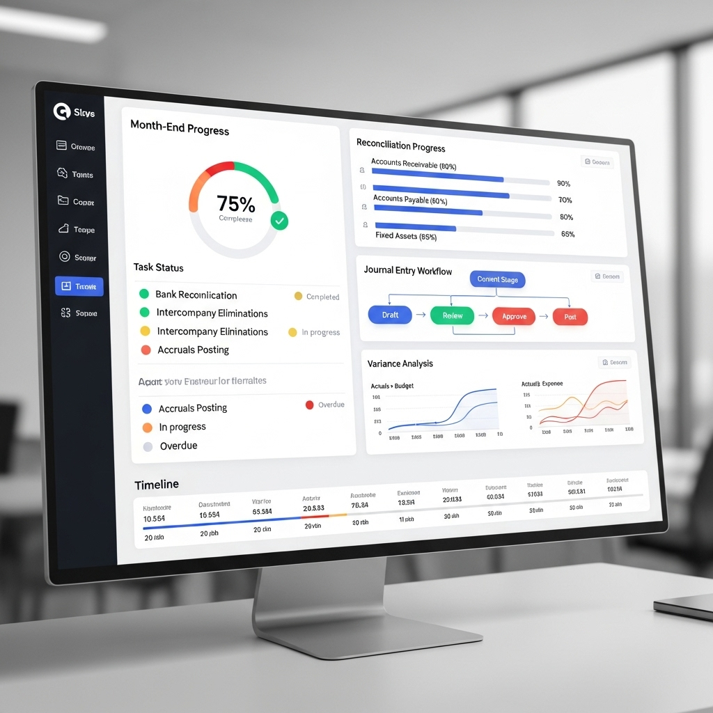
A well-designed dashboard goes beyond simple task completion percentages. It should provide actionable insights into the health and progress of the close, offering a granular view where needed:
- Task Status by Area & Owner: This involves visualizing the completion status of all key close tasks (e.g., subledger closures, intercompany reconciliations, specific accrual calculations, journal entries, right through to consolidation steps). These tasks should be clearly grouped by functional area (such as Accounts Payable, Accounts Receivable, General Ledger, Tax, Consolidation) and assigned to a responsible owner. Effective visualizations here might include swim lanes or Gantt-style progress bars, immediately highlighting areas that are falling behind the planned schedule and requiring attention.
- Reconciliation Progress: Critically tracking the status of all significant balance sheet account reconciliations is paramount. Key metrics to display would include the total number of accounts reconciled versus the target number, the aging profile of unreconciled items (to flag those outstanding for too long), and the monetary value of any identified reconciling differences. Further distinguishing between reconciliations performed through automated tools versus those done manually can add another valuable layer of insight into process efficiency and risk.
- Journal Entry Monitoring: The dashboard should display the volume and current status of journal entries) for example, how many are drafted, pending supervisory approval, have been rejected (and why), or are fully posted. Highlighting unusually large or non-standard journal entries that are awaiting approval can quickly pinpoint potential bottlenecks in the workflow or flag transactions that might warrant closer scrutiny for control purposes.
- Variance Analysis Snippets: Incorporating high-level, summarized variance analysis (e.g., actual results versus budget or forecast for key Profit & Loss lines or Balance Sheet accounts) directly into the dashboard can provide crucial early warnings. This allows management to identify significant financial fluctuations that require investigation during the close process itself, rather than discovering them only after the books are notionally closed.
- Control Performance Indicators: For organizations that have integrated automated controls within their ERP systems, tracking the operational status or any exceptions related to critical financial close controls adds a vital governance layer. This could include monitoring system access reviews, the success/failure rates of automated matching rules, or segregation of duties alerts pertinent to close activities.
Design and Technology Considerations
Drawing on established principles for creating effective financial dashboard design, a financial close dashboard must prioritize clarity, intuitiveness, and a clear informational hierarchy. It’s essential to use unambiguous visual cues, such as RAG status colors (Red, Amber, Green), consistently across all dashboard elements to denote urgency or status. The main dashboard view should provide a high-level summary, acting as a starting point, with obvious and easy-to-use drill-down paths that allow users to navigate into more detailed task lists, specific reconciliation statuses, or individual journal entry details.
The technology choice (typically between dedicated BI tools like Power BI or Tableau and custom development with libraries like React) depends on integration needs and customization requirements. BI tools offer faster development and robust standard visualizations, often sufficient if the underlying ERP data (like status fields in NetSuite’s close checklist) is readily accessible. React allows for highly tailored UX and integration with multiple data sources but requires more development effort. Regardless of the tool, seamless integration with the ERP and potentially task management systems is paramount.
The Value of Real-Time Insight
Implementing a financial close dashboard isn’t just about creating visuals; it’s about fostering a data-driven approach to a critical business process. It empowers finance leadership to identify bottlenecks proactively, allocate resources effectively, enforce accountability, and ultimately shorten the close cycle while improving accuracy and control. It transforms the close from an opaque marathon into a transparent, manageable process.
How does your team currently track month-end close progress? Share your experiences and challenges on LinkedIn.